FACT Fitness
Driving 155% Conversion
Growth by Redesigning
the Booking Experience
Role: Product Designer
Duration: 160 hours
Skills:
Business Strategy
User Research
Information Architecture
Branding
UI Design
Status:
Live (v1.2)
Product Designer - Blake Lemons
Product Strategist - Jes Eng
Client:
Business Owner - Armand Crespo
The Setup:
“I need a training plan and
probably a run crew. The
problem is… where?”
J.A.
Amateur Marathoner
Problem: Motivated runners can't easily access FACT's program details on their website, preventing them from joining a supportive fitness community.
Picture this, Coach Armand Crespo needs you to transform FACT Training's underperforming website into a high-performing digital presence that attracts new athletes while better serving their existing Pasadena fitness community.
Consultation requests had plateaued at two per month, mobile conversion was half that of desktop, and users couldn't find the essential weekly training schedule.
The challenge deepened: The stakeholder wanted to keep using Wix despite its design limitations. I focused on understanding users to inspire creative solutions within these constraints.
Define:
Uncovering the Real Story
Five interviews with potential users, from seasoned marathoners to high school athletes, revealed patterns that completely redirected my design approach.
Schedule Crisis:
Every user searched for practice schedules but couldn't find them.
Confidence Gap:
Users wanted assurance they belonged through the coach's authentic voice and community stories.
Community Hook:
Users actively seeked social proof and community connection before making contact.
Mobile Reality:
Mobile users encountered small text, crowded layouts, and poor navigation.
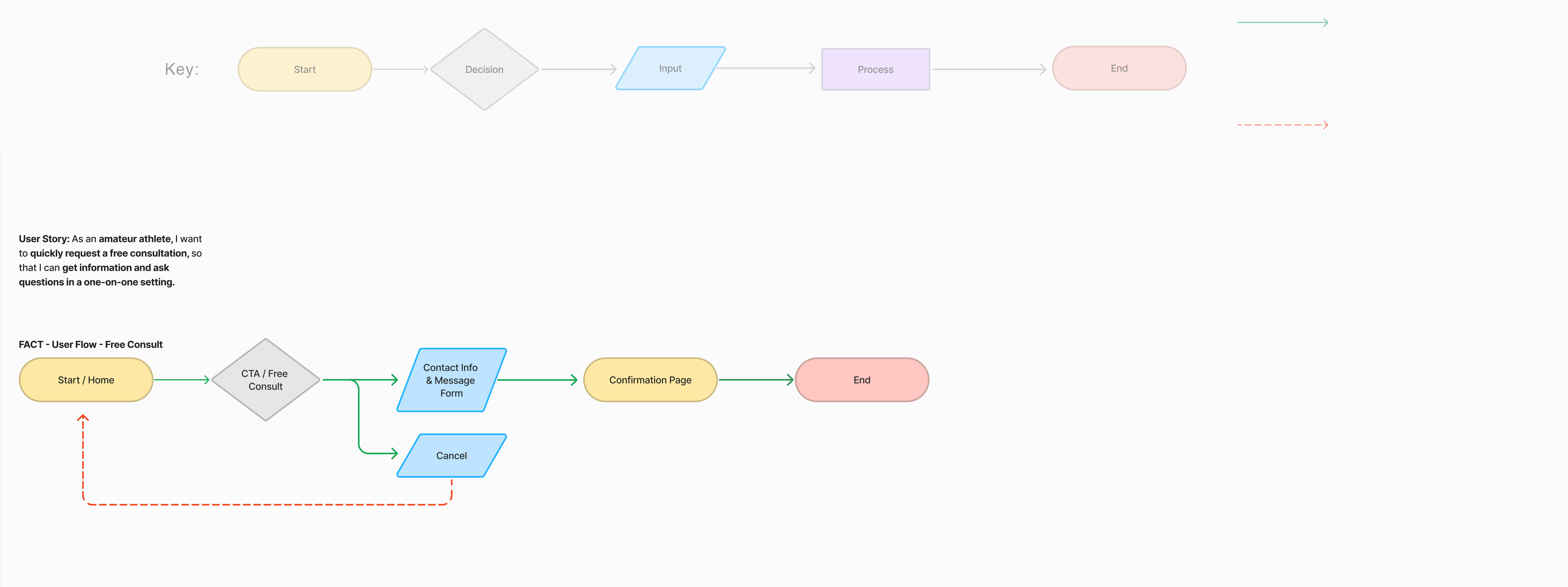
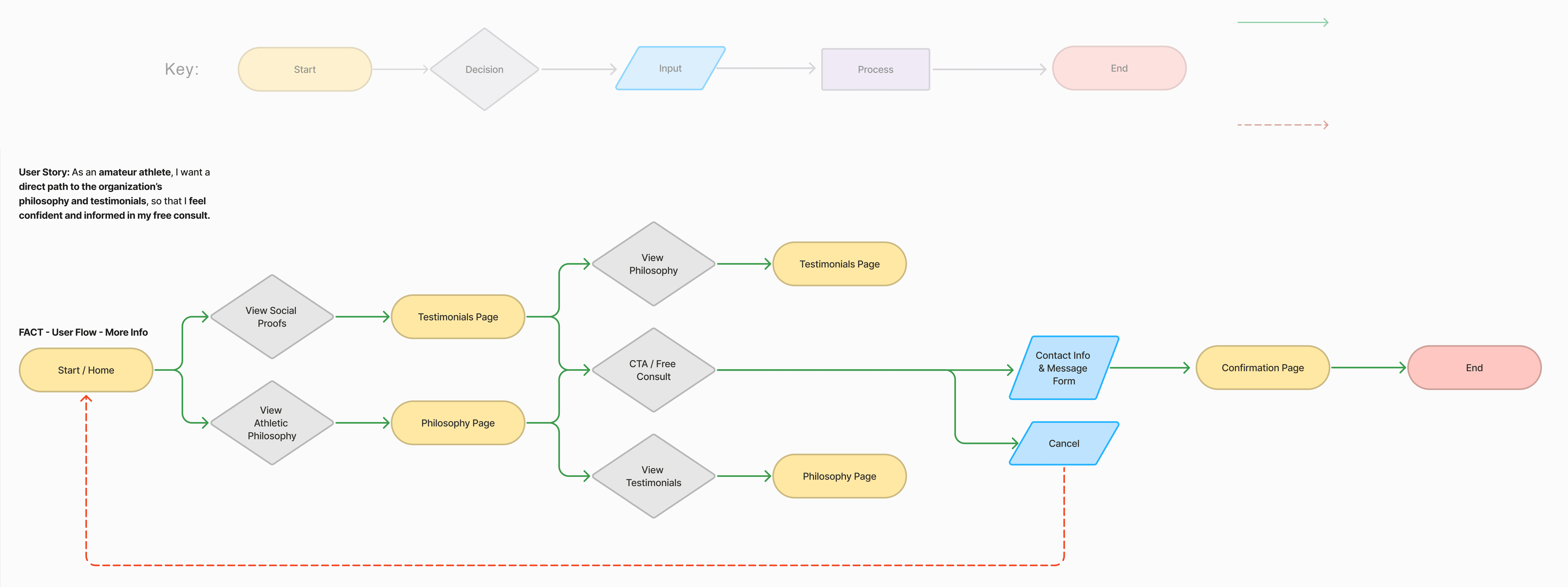
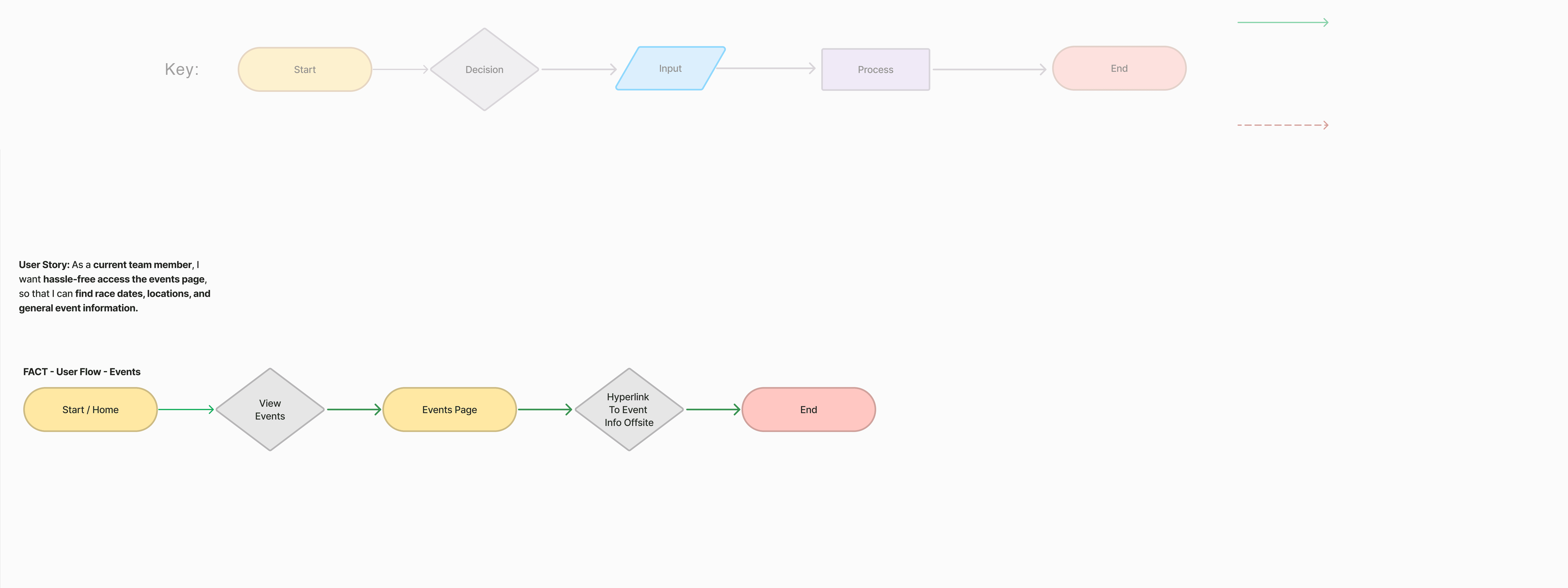
Information Architecture
The existing site structure created friction by not matching user search patterns. My new architecture prioritized user flows over organizational preferences:
The Quick Convert
User Story: As an amateur athlete, I want to quickly request a free consultation, so that I can get information and ask questions in a one-on-one setting.
Click To View
Large Format
The Researcher
User Story: As an amateur athlete, I want a direct path to the organization’s philosophy and testimonials, so that I feel confident and informed in my free consult.
The Event Enthusiast
User Story: As a current team member, I want hassle-free access the events page, so that I can find race dates, locations, and general event information.
Lo-Fi Exploration:
Blending Animation Methodologies With UX
Hand-drawn wireframes became my home base, a safe place that invited creative iteration and unconventional solutions that could be tested immediately.
Drawing from animation, I applied color scripting methodology from animated films to plan how color affects storytelling and emotion.
The behind-the-scenes approach may be invisible to users, but it sharpens design decisions and creates cohesive experiences by subtly guiding emotions.

These prototypes became my testing ground with five users, inviting immediate feedback that revealed both validation and a critical oversight.
The Critical Mass:
Users still couldn't find the training schedule. Even in wireframes, our primary user need wasn't being met.
Validation:
Users were excited about the mobile-friendly direction and community-focused tone that resonated strongly.
Or, as one user put it—
"I still think the schedule needs
to be easier to spot. Or are we
still using Facebook?"
This feedback forced me to rethink our hierarchy: the schedule needed immediate visibility, possibly in main navigation or as a homepage feature.
When I shared this feedback, the stakeholder resisted detailed agendas but agreed to make training days and times highly visible.
The Visual Identity:
Branding For Athletes
My animation background became a superpower when FACT needed a complete brand overhaul to compete with top-tier companies: new logo, colors, and business motto: The Hollywood Makeover.
Logo Design


Slogan Concept
FACT has zero direct competition in East LA. Their unique angle: coach-led training with genuine community joy where members celebrate victories together, creating infectious energy.
Club Vibes,
Coach Led!


Emblem Design
FACT had an existing Greek gods emblem on merchandise, but the amateur execution didn't match their professional needs. I refined it to maintain mythology elements while improving craftsmanship and brand cohesion.
High Fidelity Reality
When Prototypes Meet Users
Working with the strategist, I refocused design elements: featuring dynamic training video as hero while scaling back complex graphics, leveraging Wix's strengths while maintaining emotional impact.
Testing the polished designs with 5 users revealed clear patterns about what was working.
Consultation
Completion
Rate
Of Users
Give Overall
Design
Approval
However, some experience killers remained. This revealed users were deeply engaged with community stories but weren't converting. The high-value content worked; our calls-to-action didn't.
Reported Broken
Back Buttons
The solution was simple, a tweak of color to pop the CTA gave the users the focusing that they required. All back buttons were also repaired.

→

View FACT's Wix Site
The Resolution:
Success Metrics That Matter
We knew that the process had led us to success when we heard from Armand just a few weeks later:
"New bookings are up!
The Numbers That Matter
Within 30 days, Wix analytics revealed steady growth with meaningful improvements that directly addressed identified user pain points.


Project Impact:
Streamlined user flows increased consultation bookings
Mobile-first design improved accessibility across devices
Clear brand positioning differentiated FACT in the market
Systematic approach to constraints turned limitations into features
Personal Growth:
Mastered IA through iteration
Developed athletic brand aesthetic expertise
Learned to balance innovation with practical implementation
Strengthened cross-functional collaboration skills
The website was finally working as hard as FACT's athletes but if I had the chance to scale this project, I would focus on developing self-updating community features like member achievement feeds and results pages, while implementing comprehensive analytics to optimize conversion funnels. Most importantly, I'd create a user-friendly system for Armand to post workouts directly on the website, finally solving the schedule visibility issue that drove users to Facebook instead of converting on-site.