SpotSpot
Role: Product Designer
Duration: 120 hours
Skills:
User Journey Map
A/B Testing
User Research
UI Design
Branding
Status:
In Development
Team:
Product Designer - Blake Lemons
Product Strategist - Jess Eng
Users:
Children (Ages 6-12) & Parents
The Setup:
When Distance Kills Creativity
"Can I hold up Facetime while
drawing in Procreate AND
reading in Google Docs? NO."

E.V.
Age 9
Problem: Children lack digital spaces for creative collaboration with distant friends, forcing them into in-person playdates or adult-oriented tools.
Picture this, two kids sprawl across a living room floor, sketchbooks open, colored pencils scattered around them. Swapping drawings and trading story ideas, they weave their imaginations together until it's hard to tell where one child's work ends and the other's begins. It's pure creation and collaboration in its simplest form.
But what happens when that friend moves across town? Across the world?
Dramatization
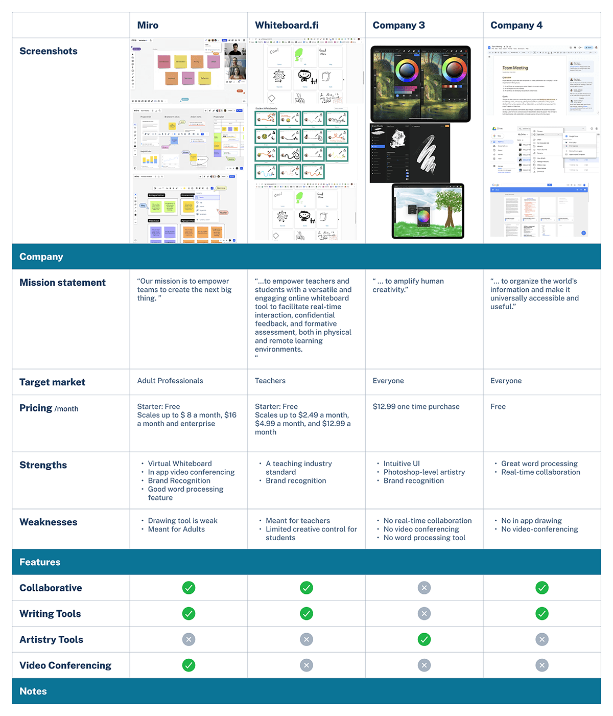
Currently, kids struggle with adult tools like Zoom and generic whiteboards that don't support their natural creative process, describing digital collaboration as "awkward" and "too limited."
The market offers classroom tools and professional whiteboards, but children lack a digital playground built specifically for their creative collaboration on their own terms.
Define
What's the What?
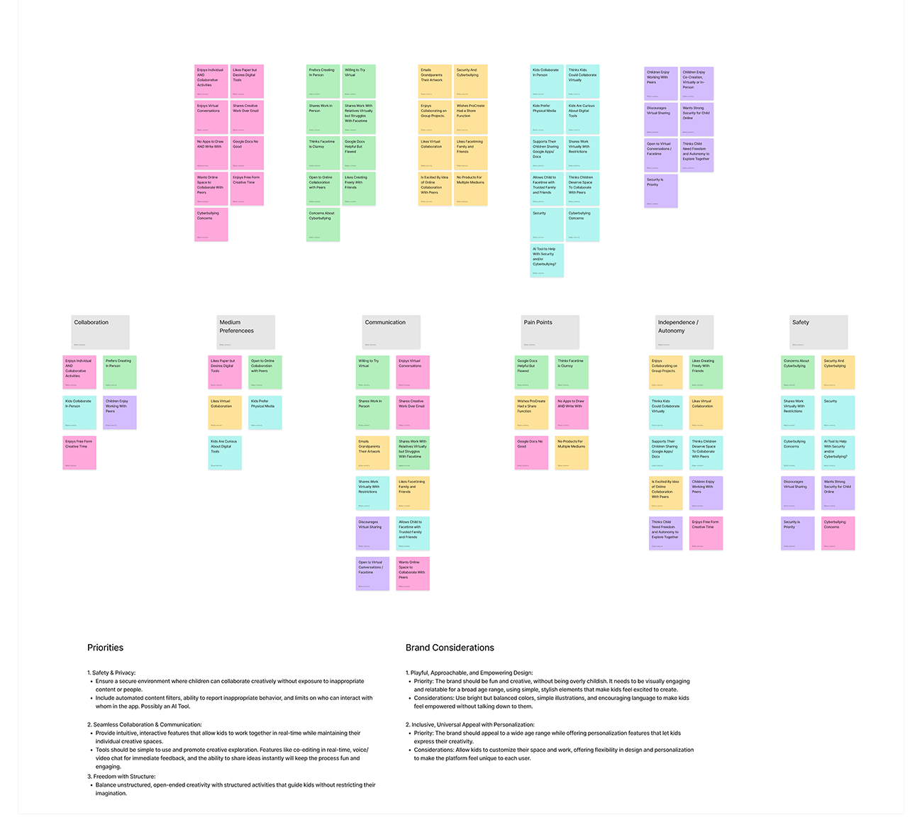
I had a seed of an idea for this product but, through interviews with five children (ages 6-12) and their parents, a clear pattern emerged that would completely reshape my approach.
User Research revealed four critical insights:
Visibility Crisis:
Kids wanted to see their friend's creative process as it happens, not just the final result.
Multi-Space Need:
Children enjoy having their own creative spot alongside a shared area.
Safety Imperative:
Parents valued closed network approaches but needed transparency about what content gets shared externally.
Tablet First:
Children primarily used tablets, requiring interfaces designed for finger or stylus drawing.
The Research Revelation: Kids naturally understand spatial concepts of mine, theirs, ours. This became the foundation for everything, from branding to UI.
As E.V. put it:
"It would slay if we could
see each other's spots..."

Strategic Framework
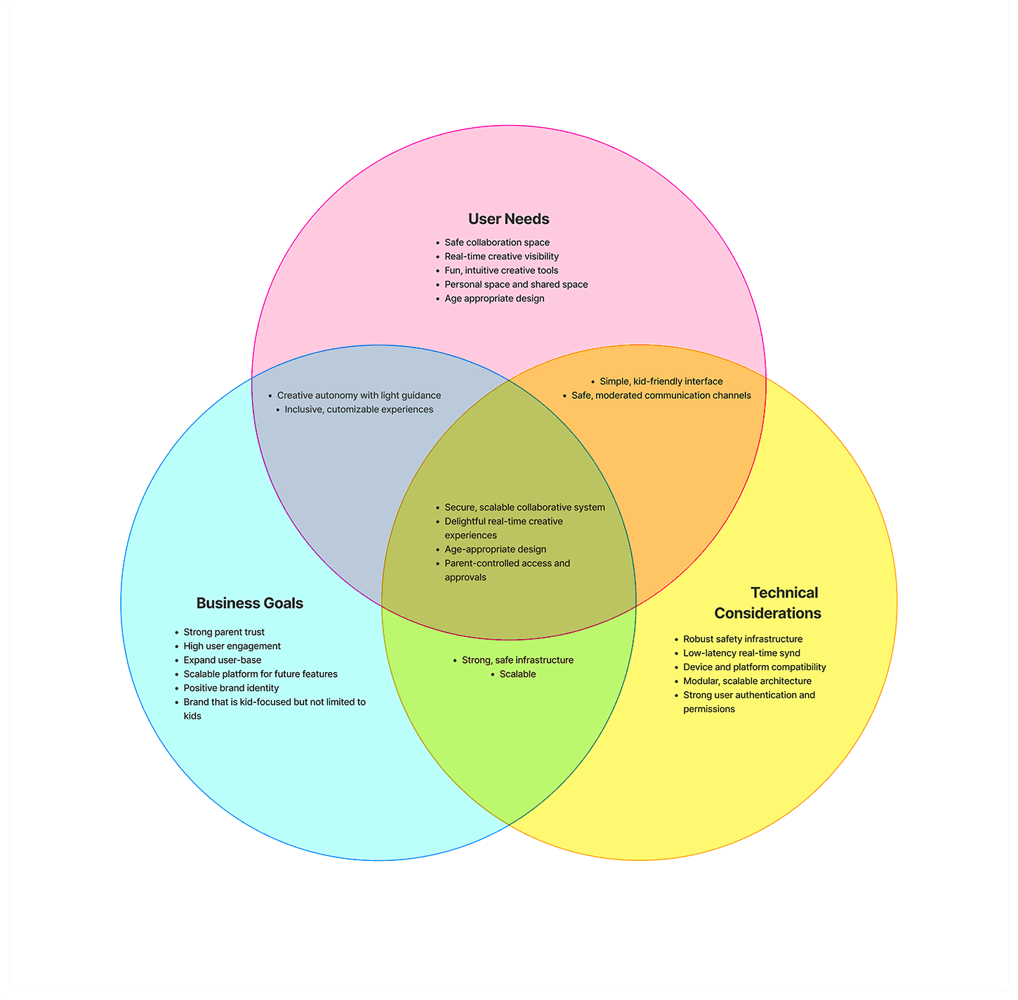
These insights led me to create a three-circle Venn diagram that became the project compass, balancing user needs, business goals, and technical considerations.
The sweet spots revealed the core solution: secure, scalable collaborative systems that deliver delightful real-time creative experiences with age-appropriate design.
Personas, Problems, and Possibilities
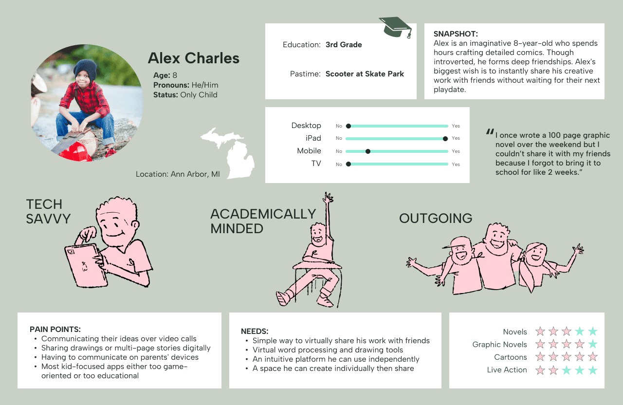
Meet Alex: Our Star Pupil - An imaginative 8-year-old creator who needs a digital space to collaborate on stories and artwork with friends who live across town because spontaneous creative collaboration shouldn't be limited by physical distance.
How Might We create a digital creative playground that gives kids like Alex the joy of side-by-side creation with distant friends while giving parents complete peace of mind?
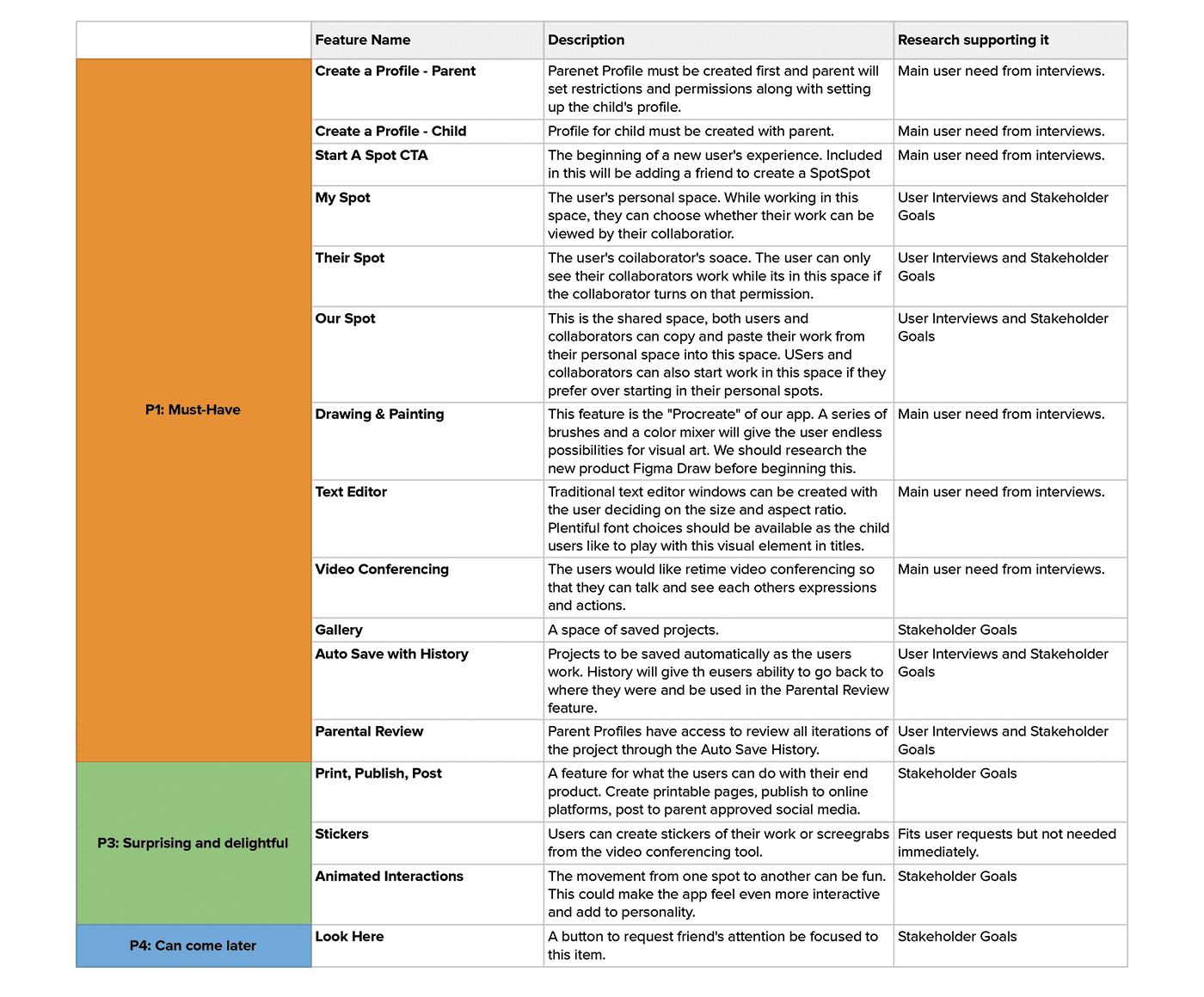
The Five-Workspace Solution: This research led to the core innovation: a five-workspace system that mirrors children's natural spatial understanding.
But hang on, workspace? In research, I found that 4 out of 5 children referred to these spaces as “spots”. This term seemed endearing and distinctive.
And thus, the SpotSpot branding was born.
My Spot: Personal creative space for individual work
Their Spot: View-only window into friend's space
Our Spot: Shared collaborative canvas
Them: Video connection to see and talk with friend
Me: Personal video feed and controls
Building the Foundation: Information Architecture
SpotSpot's site map balanced the five-spot system with parental controls, creating parallel navigation paths—one for kids' fluid creativity between spots, another for parents' safety oversight and session monitoring without disrupting the creative experience.
Three Critical User Journeys
The Guardian Begins
User Story: As a parent of a creative child, I want to create secure accounts for my family and connect with trusted friends, so that my child can safely collaborate on creative projects with friends and family members.
The Collab Starter
User Story: As a child user, I want to start a new creative project space, so that I can begin working on my ideas and invite my friend to create together.
The Team Returns
User Story: As a child user, I want to rejoin a project, so that I can continue a creative project with my friend.
Lo-Fi Validation
The Spots and the Gaps
Hand-drawn wireframes became our testing ground with six users, immediately revealing both the power and pitfalls of the five-spot concept.
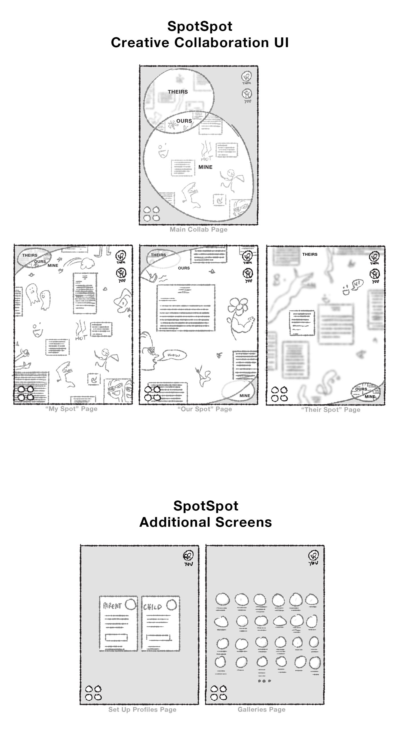
And that immediate feedback revealed both validation and a critical oversight.
Validation:
Children immediately grasped the "my spot, their spot, our spot" framework.
The Critical Mass:
However, navigation between spots confused users, with only
1 out of 6 able to navigate without assistance.
As one user put it:
"So, do I, like, exit? And then
do l… load their spot?
I don't understand."

This feedback forced a fundamental rethink: the concept was solid, but the execution needed to feel as intuitive as physical collaboration.
The Visual Identity:
Designing For (Not Down To) Kids
The Design Gauntlet: Creating a visual system that appeals to ages 6-12 while earning parent trust and allowing for future scaling beyond just kids.
My experience in children's entertainment became crucial when SpotSpot needed a brand that felt kid-appropriate but not babyish, or as EV specifically requested: "Don't make it baby. Just don't make it baby."
Logo Design

Tactile Design Elements
In order to create the safety of that living room creative zone, I decided that the design elements should feel tactile, like the texture of paper or the carpet users would rest their arms on while drawing and writing together in real life.
I explored Figma's new Draw features to create a design aesthetic that feels tactile, ultimately landing on using the "dissolve" effect to accomplish border lines that gave users a visual they could almost touch.
I applied the same tactile philosophy to the app's background using Figma's "noise" effect, creating a subtle texture that mimicked the gentle imperfections of paper or canvas. This background noise gave the entire interface a warm, organic feel that distinguished SpotSpot from the sterile digital environments children typically encounter.
Blending Animation and UX
Storyboarding Beyond Traditional UX
To truly understand how children would experience SpotSpot, I needed to map their complete emotional journey—not just the functional steps they'd take within the app.
Drawing from my animation background, I applied cinematic storyboarding techniques to create a comprehensive user journey map that captured both the experience of the child user and the parent user.
The cinematic method captured emotional beats that traditional mapping would miss, informing everything from the celebratory microinteractions when completing a project to the eventual need for export and sharing features that users naturally expected but hadn't explicitly requested.
This emotional mapping informed my interface design, but when my initial collaborative UI solution received harsh feedback ("clunky," "messy," "ugly compared to the rest of the app"), I knew just incremental improvements wouldn't work.
A/B Testing
I developed two competing approaches:
MVP1: The Circle Vision My creative instinct led me to use circles for separate Spots, creating a more organic, playful feel that matched my animation aesthetic.
MVP2: The Bento Box Approach Soft-cornered rectangles in a traditional grid layout that maximized usable space and felt familiar to users.
A/B Results:
What the People Want
The results were decisive: users preferred MVP2's rectangular approach by a significant margin. The microinteractions I added brought the fun element without sacrificing usability.
This taught me that sometimes creative vision must bow to user needs—the interface should disappear so the creativity can shine.
High Fidelity Reality
Kids Are the Most Honest Critics
The polished designs underwent rigorous testing with 6 users (4 children, 2 parent), revealing dramatic improvements from the lo-fi disaster.
Profile
Completion
Rate
Collaborative
Task
Success
4.5/5
Design Rating
(up from 2.1/5
in LoFi)
The Technical Reality:
Safety First, Creativity Always
Building for children required addressing parental concerns that don't exist in adult-focused design.
4.6/5
Parents rated in-app security highly
2.3/5
Parents had serious concerns about the potential of external sharing
The Design Challenge: How do you create thorough safety without killing the user experience?
Streamlined Onboarding: The account setup process became a balance of thoroughness and simplicity. Parents first create & confirm their account, then set up their child's profile.
Transparent Monitoring: Rather than constant surveillance, parents receive session summaries via email after each SpotSpot collaboration.
Controlled Connections: The closed network solved the friend connection challenge elegantly: children can only connect with accounts that went through the parent-verified process.
Technical Constraints as Design Drivers: The five-spot layout emerged from limitations. Running three simultaneous whiteboards required careful resource management.
This approach satisfied both user groups: kids got creative freedom, parents got peace of mind.
We knew that the process had led us to success when we heard from Armand just a few weeks later:
"Now I can actually navigate
to where to draw with my friend
and it looks slay!"

"And I'm cool with her on the app
unsupervised because I trust the
security process."
View Blake's Prototype
The Interface Evolution:
The successful redesign focused on visual consistency and intuitive interactions. However, new opportunities emerged from success:
Offline/asynchronous work capabilities
Image integration from internet sources
Line smoothing for cleaner artwork
Basic geometric shape tools
Smart spell check that ignores creative names
AND, most notably, the ability to share what they’ve created
The users weren't just satisfied, they were already envisioning how to use SpotSpot for more complex creative projects.
The Resolution:
Kids + Engagement = Success Metrics
Unlike business apps measured in conversions, SpotSpot's success lived in engagement and delight metrics that actually mattered to families.


But the real victory came in authentic user feedback:
"Code this up or whatever!
GET THE APP IN MY HANDS."

Reflection
Kids aren't small adults:
Their mental models, attention spans, and interaction patterns require fundamentally different design approaches.
Collaboration ≠ Individual × 2:
Successful individual interfaces don't automatically translate to multiplayer collaborative spaces.
Safety enables creativity:
Instead of constraining design, thoughtful safety features gave parents confidence to let children explore freely.
Scaling SpotSpot
Looking ahead, the next critical feature is developing the publish/present/share functionality that emerged from user journey mapping. Children naturally want to showcase their collaborative creations, whether through digital galleries, printable documents, or presentations to extended family.
The challenge: enabling sharing and presentation without transforming SpotSpot into social media. The solution lies in maintaining the closed-network approach while adding controlled sharing mechanisms like digital portfolios that parents can approve for specific audiences, presentation modes for family video calls, and print-friendly formats for physical sharing.
Beyond content sharing, SpotSpot's next evolution would involve cross-platform compatibility. Expanding to phone and laptop versions would unlock new use cases.
